Client project · Website demo
PR4M
My first client website: introducing an established office planning and project management company through its services and completed work.
- My role
- Client communication & website development
- Built with
- Next.js · React · TypeScript · Tailwind CSS
- Project link
- View demo (opens in a new tab)
The brief
PR4M was already working on office projects for large companies, but did not have a website. They needed a place to introduce the business, explain its services, and show the work they had completed. This was my first client project, so it was also my introduction to working through meetings, understanding requests, and turning them into a website for an established company.
What I built
Introducing the company
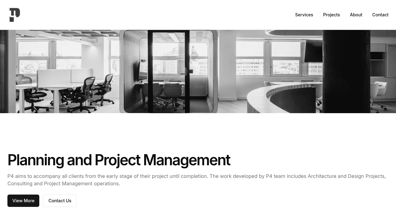
The homepage gives visitors an introduction to PR4M’s work, with office photography, a description of the business, and clear routes to projects and contact information. The company’s existing visual style was close to the clean, restrained design I already enjoyed building, which made the direction feel like a natural fit.
Showcasing completed office projects
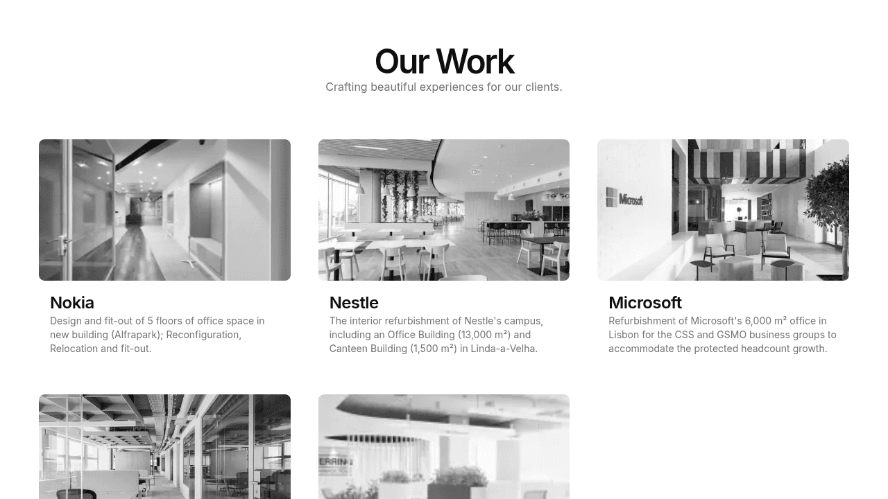
The projects section gives the company’s work space to speak for itself. Visitors can browse photographs and short summaries, then open a project to explore its location, scope, services, and image gallery. The focus is on the offices PR4M helped deliver and the work involved in each one.
Key decisions
Understand what the client wanted to communicate
The hardest part was the client communication. Meetings were a chance to understand their requests, what mattered to the company, and what they wanted to feature on the website. I had to translate those conversations into a structure and design that represented the business appropriately.
Build on a visual style that already fit
The company’s visual identity aligned well with my preference for simple, clean interfaces. I used a restrained palette and large photographs to keep the attention on the work, while giving service and project pages a consistent structure.
Give the project portfolio a reusable structure
Project information is kept in one shared data file and used across the homepage, listing, and detail pages. Each project can have its own scope, services, and gallery without needing a separate page component. This gives the website room to showcase more work over time.
What I learned
The client was happy with the website and felt it met their needs, but it did not proceed to a company launch. Full-resolution project photographs were still needed, and the company did not have time to prepare them for publication. The version linked here is a demo. For me, it was a valuable first experience of client meetings, understanding requests, and building a website that represented a real business.