Personal project · Interactive 3D
3D Brain
A personal brain explorer inspired by the medical 3D applications I build at work, with interactive regions, animated camera views, and a mobile layout.
- My role
- 3D interaction & interface development
- Built with
- Three.js · JavaScript · Vite · Tailwind CSS
- Project link
- Live project (opens in a new tab)
Why I built it
I wanted to build a small application for my portfolio with the kind of 3D interaction, animation, and information panels I work with in medical applications at my job. It was also a learning project: a place to explore ideas and improve my understanding of 3D application development, then take that experience back into my work.
What I built
Exploring the brain
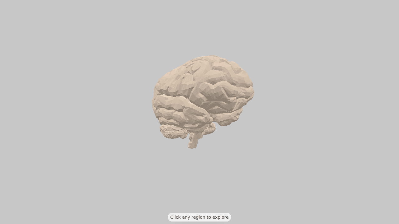
I integrated a free brain model downloaded online and built the interaction around it. Visitors can rotate and zoom the model, hover over regions to see their names, and select a region to explore it further. My work focused on the application and the experience around the model.
Showing information in context
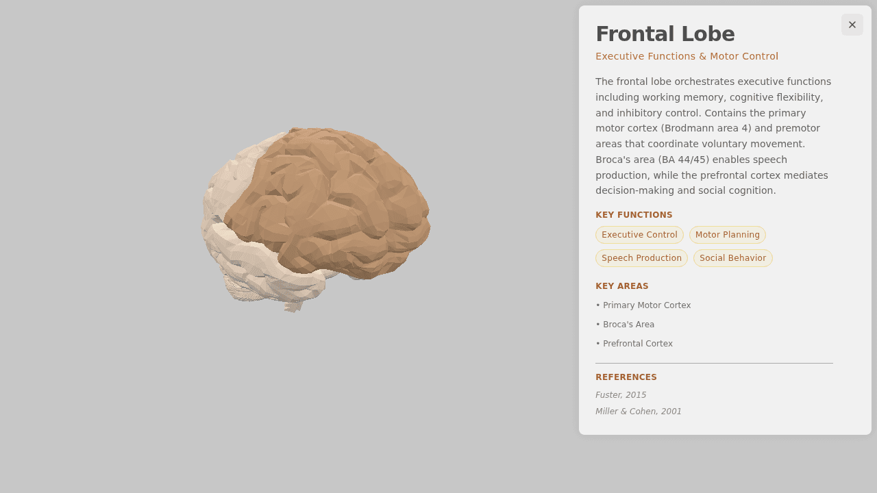
Selecting a region highlights it, moves the camera to a related view, and opens an information panel. The panel brings the description, functions, key areas, and references together while keeping the model visible. Closing it returns to the full exploration layout.
Key decisions
Keep animations responsive
Animation performance was the hardest part of the project. Camera transitions move around the model along an arc, and the framing adjusts as the information panel opens. The viewer schedules frames when interaction or animation changes the view, pauses rendering while the tab is hidden, and caps the pixel ratio to limit rendering cost.
Connect selection, camera, and information
Region names in the model connect to a shared set of content and camera positions. Raycasting identifies the selected region, while pointer movement distinguishes a click from a drag. This lets visitors rotate the model without accidentally opening information and keeps the selected region, camera view, and panel in sync.
Make space for the model on mobile
Creating a useful mobile version was another challenge. The information panel sits beside the model in landscape and at the bottom in portrait, with the viewer framing changing to make room. Touch interaction supports rotation and pinch zoom, and reduced-motion preferences skip the animated camera and framing transitions.
What I learned
This project helped me learn more about building 3D applications, especially the relationship between animation performance, camera movement, and mobile layout. It gave me a personal example of the interaction patterns I work with professionally. The main thing I would improve next is the brain model itself: the free model serves this demo, but it is less detailed than the models used in the applications at my company.